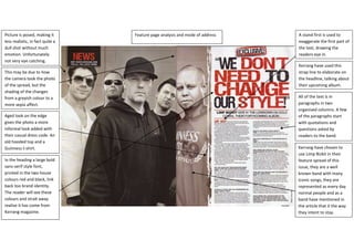
1. Feature page analysis and mode of addressKerrang have chosen to use Limp Bizkit in their feature spread of this issue, they are a well known band with many iconic songs, they are represented as every day normal people and as a band have mentioned in the article that it the way they intent to stay.All of the text is in paragraphs in two organised columns. A few of the paragraphs start with quotations and questions asked by readers to the band.Kerrang have used this strap line to elaborate on the headline, talking about their upcoming album.A stand first is used to exaggerate the first part of the text, drawing the readers eye in.In the heading a large bold sans-serif style font, printed in the two house colours red and black, link back too brand identity. The reader will see these colours and strait away realise it has come from Kerrang magazine.Aged look on the edge gives the photo a more informal look added with their casual dress code. An old hooded top and a Guinness t-shirt.This may be due to how the camera took the photo of the spread, but the shading of the changes from a greyish colour to a more sepia affect. Picture is posed, making it less realistic, in fact quite a dull shot without much emotion. Unfortunately not very eye catching. 933450478790<br />